
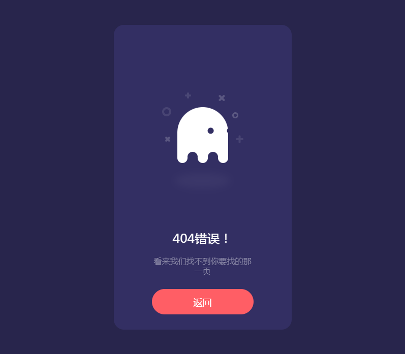
分享一款自适应幽灵404页面源码,这是一款简约的单页源码,可以点击返回按钮后跳转到网站首页,利于SEO网站优化。
页面展示

下载地址
https://dmfhy.lanzout.com/iEmQ914ascwd
代码展示
<!doctype html>
<html>
<head>
    <meta charset="utf-8">
    <meta name="viewport" content="width=device-width, initial-scale=1.0, minimum-scale=1.0, maximum-scale=1.0,user-scalable=no">
    <title>幽灵404页面 - www.xiaolanzy.com</title>
    <script type="text/javascript" src="assets/js/jquery.min.js"></script>
    <style>
        html, body {
            background: #28254C;
            font-family: 'Ubuntu';
        }

        * {
            box-sizing: border-box;
        }

        .box {
            width: 350px;
            height: 100%;
            max-height: 600px;
            min-height: 450px;
            background: #332F63;
            border-radius: 20px;
            position: absolute;
            left: 50%;
            top: 50%;
            transform: translate(-50%, -50%);
            padding: 30px 50px;
        }

        .box .box__ghost {
            padding: 15px 25px 25px;
            position: absolute;
            left: 50%;
            top: 30%;
            transform: translate(-50%, -30%);
        }

        .box .box__ghost .symbol:nth-child(1) {
            opacity: .2;
            animation: shine 4s ease-in-out 3s infinite;
        }

        .box .box__ghost .symbol:nth-child(1):before, .box .box__ghost .symbol:nth-child(1):after {
            content: '';
            width: 12px;
            height: 4px;
            background: #fff;
            position: absolute;
            border-radius: 5px;
            bottom: 65px;
            left: 0;
        }

        .box .box__ghost .symbol:nth-child(1):before {
            transform: rotate(45deg);
        }

        .box .box__ghost .symbol:nth-child(1):after {
            transform: rotate(-45deg);
        }

        .box .box__ghost .symbol:nth-child(2) {
            position: absolute;
            left: -5px;
            top: 30px;
            height: 18px;
            width: 18px;
            border: 4px solid;
            border-radius: 50%;
            border-color: #fff;
            opacity: .2;
            animation: shine 4s ease-in-out 1.3s infinite;
        }

        .box .box__ghost .symbol:nth-child(3) {
            opacity: .2;
            animation: shine 3s ease-in-out .5s infinite;
        }

        .box .box__ghost .symbol:nth-child(3):before, .box .box__ghost .symbol:nth-child(3):after {
            content: '';
            width: 12px;
            height: 4px;
            background: #fff;
            position: absolute;
            border-radius: 5px;
            top: 5px;
            left: 40px;
        }

        .box .box__ghost .symbol:nth-child(3):before {
            transform: rotate(90deg);
        }

        .box .box__ghost .symbol:nth-child(3):after {
            transform: rotate(180deg);
        }

        .box .box__ghost .symbol:nth-child(4) {
            opacity: .2;
            animation: shine 6s ease-in-out 1.6s infinite;
        }

        .box .box__ghost .symbol:nth-child(4):before, .box .box__ghost .symbol:nth-child(4):after {
            content: '';
            width: 15px;
            height: 4px;
            background: #fff;
            position: absolute;
            border-radius: 5px;
            top: 10px;
            right: 30px;
        }

        .box .box__ghost .symbol:nth-child(4):before {
            transform: rotate(45deg);
        }

        .box .box__ghost .symbol:nth-child(4):after {
            transform: rotate(-45deg);
        }

        .box .box__ghost .symbol:nth-child(5) {
            position: absolute;
            right: 5px;
            top: 40px;
            height: 12px;
            width: 12px;
            border: 3px solid;
            border-radius: 50%;
            border-color: #fff;
            opacity: .2;
            animation: shine 1.7s ease-in-out 7s infinite;
        }

        .box .box__ghost .symbol:nth-child(6) {
            opacity: .2;
            animation: shine 2s ease-in-out 6s infinite;
        }

        .box .box__ghost .symbol:nth-child(6):before, .box .box__ghost .symbol:nth-child(6):after {
            content: '';
            width: 15px;
            height: 4px;
            background: #fff;
            position: absolute;
            border-radius: 5px;
            bottom: 65px;
            right: -5px;
        }

        .box .box__ghost .symbol:nth-child(6):before {
            transform: rotate(90deg);
        }

        .box .box__ghost .symbol:nth-child(6):after {
            transform: rotate(180deg);
        }

        .box .box__ghost .box__ghost-container {
            background: #fff;
            width: 100px;
            height: 100px;
            border-radius: 100px 100px 0 0;
            position: relative;
            margin: 0 auto;
            animation: upndown 3s ease-in-out infinite;
        }

        .box .box__ghost .box__ghost-container .box__ghost-eyes {
            position: absolute;
            left: 50%;
            top: 45%;
            height: 12px;
            width: 70px;
        }

        .box .box__ghost .box__ghost-container .box__ghost-eyes .box__eye-left {
            width: 12px;
            height: 12px;
            background: #332F63;
            border-radius: 50%;
            margin: 0 10px;
            position: absolute;
            left: 0;
        }

        .box .box__ghost .box__ghost-container .box__ghost-eyes .box__eye-right {
            width: 12px;
            height: 12px;
            background: #332F63;
            border-radius: 50%;
            margin: 0 10px;
            position: absolute;
            right: 0;
        }

        .box .box__ghost .box__ghost-container .box__ghost-bottom {
            display: flex;
            position: absolute;
            top: 100%;
            left: 0;
            right: 0;
        }

        .box .box__ghost .box__ghost-container .box__ghost-bottom div {
            flex-grow: 1;
            position: relative;
            top: -10px;
            height: 20px;
            border-radius: 100%;
            background-color: #fff;
        }

        .box .box__ghost .box__ghost-container .box__ghost-bottom div:nth-child(2n) {
            top: -12px;
            margin: 0 -0px;
            border-top: 15px solid #332F63;
            background: transparent;
        }

        .box .box__ghost .box__ghost-shadow {
            height: 20px;
            box-shadow: 0 50px 15px 5px #3B3769;
            border-radius: 50%;
            margin: 0 auto;
            animation: smallnbig 3s ease-in-out infinite;
        }

        .box .box__description {
            position: absolute;
            bottom: 30px;
            left: 50%;
            transform: translateX(-50%);
        }

        .box .box__description .box__description-container {
            color: #fff;
            text-align: center;
            width: 200px;
            font-size: 16px;
            margin: 0 auto;
        }

        .box .box__description .box__description-container .box__description-title {
            font-size: 24px;
            letter-spacing: .5px;
        }

        .box .box__description .box__description-container .box__description-text {
            color: #8C8AA7;
            line-height: 20px;
            margin-top: 20px;
        }

        .box .box__description .box__button {
            display: block;
            position: relative;
            background: #FF5E65;
            border: 1px solid transparent;
            border-radius: 50px;
            height: 50px;
            text-align: center;
            text-decoration: none;
            color: #fff;
            line-height: 50px;
            font-size: 18px;
            padding: 0 70px;
            white-space: nowrap;
            margin-top: 25px;
            transition: background .5s ease;
            overflow: hidden;
        }

        .box .box__description .box__button:before {
            content: '';
            position: absolute;
            width: 20px;
            height: 100px;
            background: #fff;
            bottom: -25px;
            left: 0;
            border: 2px solid #fff;
            transform: translateX(-50px) rotate(45deg);
            transition: transform .5s ease;
        }

        .box .box__description .box__button:hover {
            background: transparent;
            border-color: #fff;
        }

        .box .box__description .box__button:hover:before {
            transform: translateX(250px) rotate(45deg);
        }

        @keyframes upndown {
            0% {
                transform: translateY(5px);
            }
            50% {
                transform: translateY(15px);
            }
            100% {
                transform: translateY(5px);
            }
        }

        @keyframes smallnbig {
            0% {
                width: 90px;
            }
            50% {
                width: 100px;
            }
            100% {
                width: 90px;
            }
        }

        @keyframes shine {
            0% {
                opacity: .2;
            }
            25% {
                opacity: .1;
            }
            50% {
                opacity: .2;
            }
            100% {
                opacity: .2;
            }
        }
    </style>
</head>
<body>
<div class="box">
    <div class="box__ghost">
        <div class="symbol"></div>
        <div class="symbol"></div>
        <div class="symbol"></div>
        <div class="symbol"></div>
        <div class="symbol"></div>
        <div class="symbol"></div>

        <div class="box__ghost-container">
            <div class="box__ghost-eyes">
                <div class="box__eye-left"></div>
                <div class="box__eye-right"></div>
            </div>
            <div class="box__ghost-bottom">
                <div></div>
                <div></div>
                <div></div>
                <div></div>
                <div></div>
            </div>
        </div>
        <div class="box__ghost-shadow"></div>
    </div>

    <div class="box__description">
        <div class="box__description-container">
            <div class="box__description-title">404错误!</div>
            <div class="box__description-text">看来我们找不到你要找的那一页</div>
        </div>

        <a href="https://www.xiaolanzy.com" class="box__button">返回</a>

    </div>

</div>

<script>


    var pageX = $(document).width();
    var pageY = $(document).height();
    var mouseY = 0;
    var mouseX = 0;

    $(document).mousemove(function (event) {
        //verticalAxis
        mouseY = event.pageY;
        yAxis = (pageY / 2 - mouseY) / pageY * 300;
        //horizontalAxis
        mouseX = event.pageX / -pageX;
        xAxis = -mouseX * 100 - 100;

        $('.box__ghost-eyes').css({'transform': 'translate(' + xAxis + '%,-' + yAxis + '%)'});

        //console.log('X: ' + xAxis);

    });</script>

</body>
</html>
原创文章,作者:小蓝IT,如若转载,请注明出处:https://www.xiaolanzy.com/28.html
 微信扫一扫
微信扫一扫  支付宝扫一扫


